
Spaces easier to select
complete
A
Abbie Friesen
Save a click and make the spaces dropdown as circles to click instead. I use spaces as types of jobs I have as a freelancer, so I use four types that don't change. Make it a ClickApp and I'll be happy. :)
Log In

Zeb
complete
Zeb
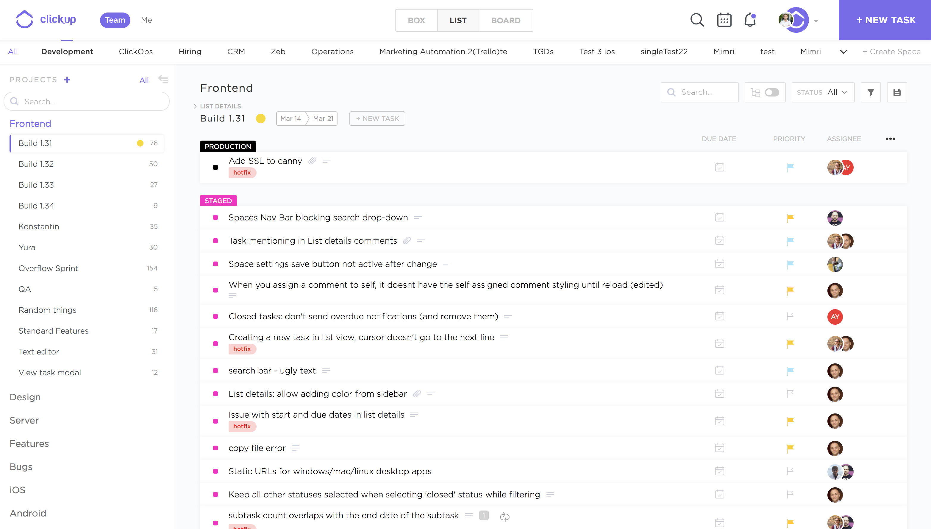
We are rolling this out in a few phases, in order to avoid a major change in UI all at once. Please bear with us as the first change does add extra spacing to the top header especially if you are only using 1-4 Spaces.
The next change we implement will solve the issue with extra spacing added by compacting the navigation bars and moving some menu items to the same area as the new Spaces navigation.
We considered the avatars design from Abbie Friesen but had these problems:
1) You can't see the full name of Space which is critical for some users
2) There isn't a good solution for showing an "active" Space that falls below the first line of circles. You could reorder the Spaces each time you switch Spaces so that the selected Space persists in the first line, but that doesn't feel expected. The other option is displaying multiple rows of Spaces but that seems to be a worse use of a Space, especially for the future.
3) It becomes difficult to show menu options for the Space, we could show a different state on hover but then that would prevent us showing the full name on hover.
We are open to continued suggestions as we want to find the best possible solution for everyone here!
Attached is the first phase roll-out.
A
Abbie Friesen
Zeb: This is a great use of space. I like the top bar having the spaces. Perhaps having the space circled in a color (like "Team") would help find the current space quicker?
Zeb
Abbie Friesen: I'm actually thrilled that you liked it! The only problem arises when you just have a couple of spaces, there's a lot of wasted space, but like I said we plan to fix that in phases to avoid change overload.
I really loved your design and it inspired a great conversation with the product team. Keep your thoughts coming! I'll work on making the selected space more visible, I don't think making it the same as the team|me is the best solution as you'll have two of the same looking items but I definitely agree we should make it a bit more visible.
Laird Sapir
Zeb: what about something like a pale (like 10-20% opacity) background behind the active space item? (just enough to make it stand out when scanning that list, not enough to cause confusion with the team | me option above)

Ivo Reis
Zeb: This change is cool, but you also need to think about people using smaller screens. Raising the top bar will leave less space to display the tasks. What if you gave the user the ability to decide whether or not to display a new bar with the Spaces? I thought about putting the views (Box, List and Board) in an icon and in that place I would put the current Space. But if the user wants to display this bar with the Spaces, it would also be an option.
I do not know how the majority uses the tool, but in my case it is totally unnecessary to always be displaying "Box, List, Board". It's something I rarely change. For me it would not be a problem to click twice to change the view.
Zeb
in progress
Zeb
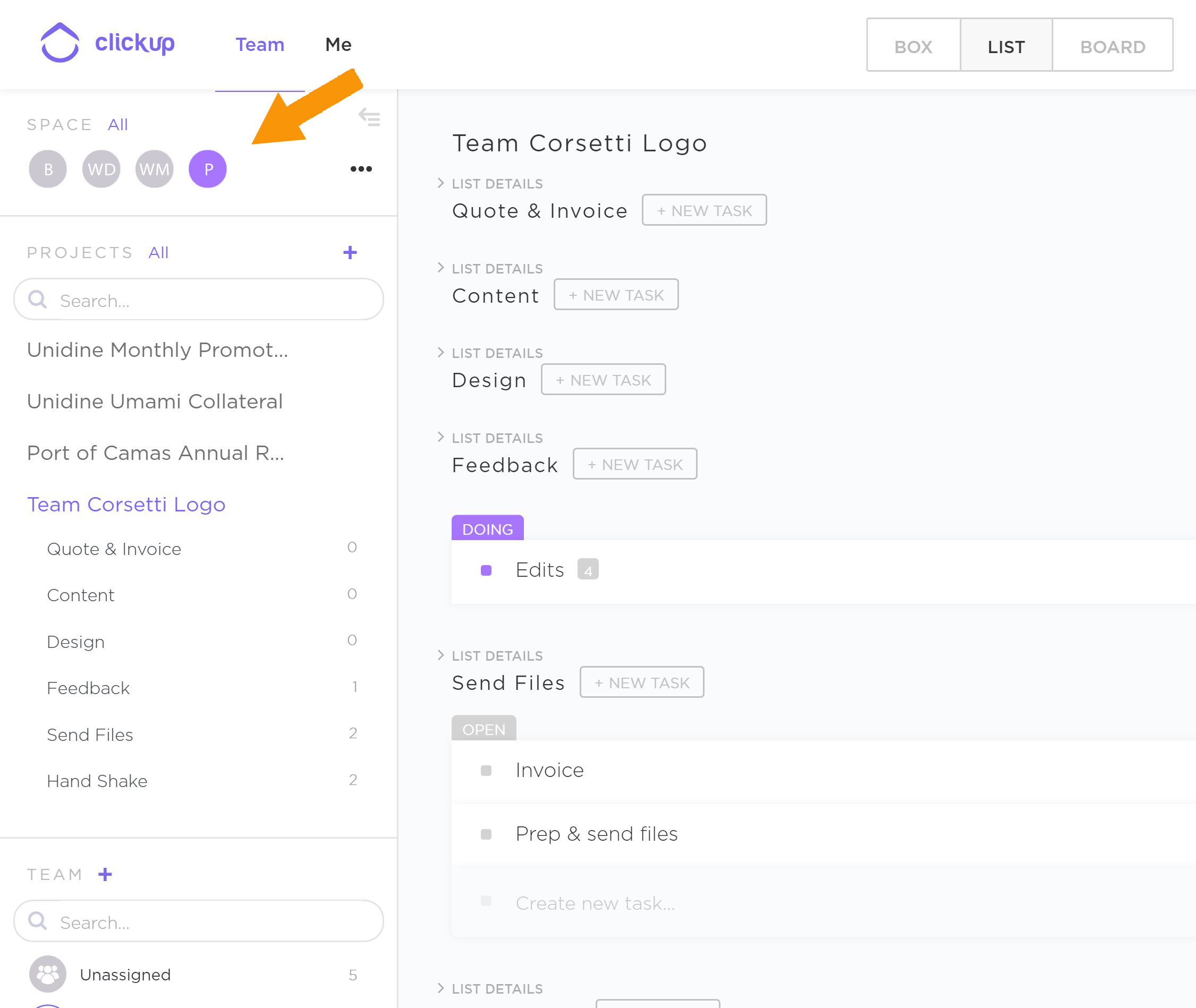
Hey Abbie! We have a redesign of Spaces coming soon, it's a bit different (the Spaces will be visible across the top header) but should accomplish the same thing. This will be released this month.
R
RoyHJ
Also:
- Choose which spaces have a quick link (configurable per space, in case you have a lot of spaces).
- Quick links directly to project/list as well.
- Make the quick link persistent with sort/filter settings.
A
Abbie Friesen
RoyHJ: Great additions!